
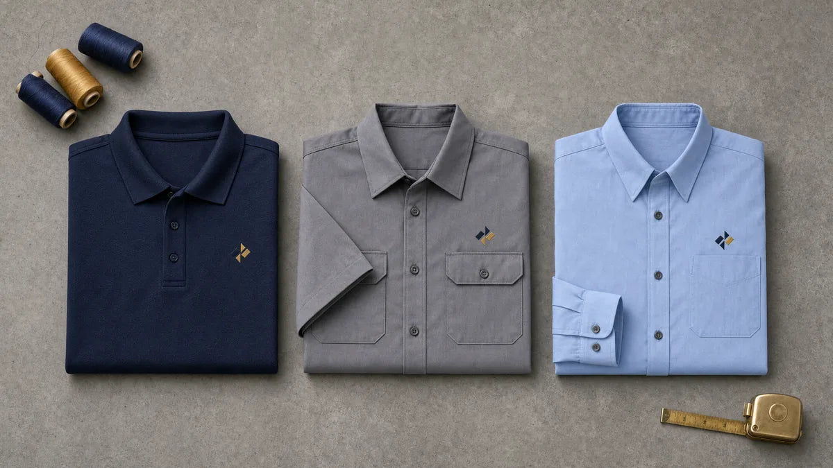
Logo placement decides whether customers read your branding or miss it entirely. The left chest, sleeve, and back panel sizes and contrast rules that work.
Custom Work Shirts • Logo Placement
Serving DeLand, Florida; Volusia County; Seminole County; Orange City; Deltona; DeBary; Daytona Beach; Sanford; Lake Mary; and surrounding Central Florida communities
When a customer opens the door or a homeowner meets your tech in the driveway, they judge your team in about three to five seconds. Getting work shirt logo placement right is what turns that first glance into trust instead of a shrug. Small choices about position, size, and contrast decide whether your branded staff shirts look sharp or forgettable.
Key Takeaways
- The left chest logo is the first thing most people read, so size it 3 to 4 inches wide.
- Contrast matters more than color choice; a dark logo on a dark shirt disappears from ten feet.
- A cracked or faded logo signals a business that stopped paying attention.
- Send vector artwork so your mark scales cleanly to any placement.
The First Three Seconds: What People Actually Register
People do not study a work shirt. They register a shape, a color, and whether the branding looks intentional. In those first few seconds a customer decides if your crew belongs on the job or just showed up in whatever was clean. That snap judgment happens before anyone reads a word of your company name, which is exactly why placement and contrast carry more weight than the logo design itself.
This is a perception problem, not an art problem. A great logo placed two inches too low, printed in a color that blends into the fabric, still reads as sloppy. The good news is that the rules for getting it right are consistent, measurable, and easy to hit once you know the numbers.
Left Chest: The Placement Everyone Reads First
The left chest is the placement a customer's eye lands on when they are talking to your employee face to face. Standard adult placement is roughly 7 to 9 inches down from the high point of the shoulder and 3 to 4 inches in from the center of the placket. On a youth cut or a smaller women's fit, that same absolute measurement lands too low and reads as a belly logo, so we move it up to match the garment.
Size is just as important as position. A typical left chest logo runs 3 to 4 inches wide. Under 2.5 inches it stops being legible across a counter, and over 5 inches it starts reading as a novelty tee rather than a uniform. Clean embroidered left chest logos give that professional, dimensional look most trades and hospitality teams want, as long as the artwork suits thread.

Fit check: Before you order across mixed sizes, ask for the left chest to be adjusted per garment size instead of one flat measurement, so it looks centered on everyone.
The Back Panel: Your Billboard at Twenty Feet
The back of the shirt is what a homeowner reads while your tech is bent over a unit, or what a passing driver sees at a job site. Full back prints commonly run 11 to 12 inches wide on adult sizes, set 3 to 4 inches below the collar seam. Place it too high and the yoke or a hunched posture swallows the top of the design, place it too low and it drifts toward the hem.

Because the back panel works at distance, bold and simple beats detailed and small. A phone number, a service line, and a clean logo read from across a parking lot when the type is large enough. For high-contrast color work at volume, screen printed back panels hold up well and stay crisp through repeated wash cycles.
A well-placed back print is free advertising every time your crew turns around. Make it readable from twenty feet or do not bother.
Sleeve, Collar, and Hem: The Placements That Signal Detail
Secondary placements do quiet work. Left sleeve placement usually sits 1 to 2 inches below the shoulder seam, centered. That is the spot people notice when someone is reaching, driving, or handing over a clipboard, which is most of a service call. A small sleeve mark or a certification badge tells a customer the details were considered.
Put your logo where customers actually look
Send us your logo and tell us the shirt colors your crew already wears, and we will mark up the placements and sizes before anything goes on press. Print ready vector artwork gives us the cleanest edges, and we will tell you exactly what we need if you only have a raster file.
Get a logo placement quote →- Left sleeve: 1 to 2 inches below the shoulder seam, centered, ideal for a secondary mark or badge.
- Collar or nape: a small tagline or website that reads when someone is behind your employee.
- Hem or lower front: subtle placement that keeps the main chest area clean.
You do not need every placement filled. Pick a primary and one accent. Overloading a shirt with marks on the chest, both sleeves, the collar, and the back reads as clutter, not as polish.
Logo Size: The Most Common Mistake We Fix
The single most frequent correction we make is sizing. Owners tend to shrink the logo to be modest, and it becomes unreadable. Others blow it up to be seen and it turns cartoonish. The 3 to 4 inch chest and 11 to 12 inch back ranges exist because they match how the human eye reads a shirt at conversational distance and at a distance.
Decoration method affects your minimum too. Embroidery has a practical detail limit: text under about 0.25 inch tall and hairline strokes under about 1.5 points fill in with thread and turn to mush. If your mark has small type or fine lines, that placement is a screen print or DTF job, not an embroidery job. Matching the method to the size is how the detail survives.
Contrast: Why the Same Logo Reads on One Shirt and Vanishes on Another
Contrast is the variable most people ignore, and it decides everything. A navy logo on a charcoal shirt is invisible from ten feet. A one-color logo needs either a light garment or a light version of the mark, so ask for a reversed or knockout version before you commit to dark shirts. This one step prevents the most common disappointment we see after delivery.
"A logo that vanishes on a dark shirt is not a printing problem. It is a contrast problem you solve before you order."
The decoration method plays a role here too. Screen printed plastisol on a dark garment needs an underbase white layer so colors do not go muddy. That underbase is why a bright red on black looks correct while red printed directly on black looks brown. For a detailed, full-color mark on a crew of ten, DTF transfers hold fine detail and gradients better than screen printing at small run sizes, which often makes them the practical choice.
| Consideration | Screen Print | DTF Transfer |
|---|---|---|
| Best run size | Larger quantities | Small crews and short runs |
| Fine detail & gradients | Needs underbase on dark | Holds detail and full color |
| Feel on lightweight polos | Depends on ink coverage | Thin, flexible transfer |
Why Placement Is a Trust Signal
A consistent, correctly placed logo tells a customer your business runs on standards. When every employee's mark sits in the same spot at the same size, the crew looks like a team instead of a group of individuals. That perception matters in the trades, in hospitality, and in healthcare, where a uniform doubles as a credential. There are real reasons why small businesses put staff in uniforms, and clean branding is a big part of it.
Placement also intersects with safety apparel. If your team wears high-visibility or protective garments, decoration should never compromise the gear, and employers should understand their obligations under OSHA's general PPE requirements standard. We work around reflective striping and hit placement rules that keep the garment doing its job.
A Faded Logo Says More Than No Logo
Condition matters as much as position. A cracked, lifting, or faded logo reads as a business that has stopped paying attention, and that impression sticks harder than a plain shirt would. Customers do not think "that print is worn," they think "this company cuts corners." Rotate shirts out on a schedule rather than waiting for someone to complain.

Durability starts with the right build. Thread count and stitch density add stiffness, so a dense 12,000 stitch logo on a lightweight moisture-wicking polo will pucker unless it is backed properly, with cut-away backing for knits and tear-away for stable wovens. Matching backing to fabric is a quiet detail that keeps a logo flat and readable through a long Central Florida summer.
What to Send Us So Placement Comes Back Right
The fastest way to a shirt that looks right is clean artwork. Vector files, meaning AI, EPS, or PDF with live paths, let us scale a mark to any placement without softening the edges. A 72 dpi JPG pulled off a website cannot be rescued for embroidery digitizing without a redraw, so start with the best file you have. If your logo carries brand protection, it helps to understand the USPTO's explanation of what a trademark is and how it differs from copyright.
- Vector artwork (AI, EPS, or PDF with live paths) for the sharpest results.
- A reversed or knockout version of the logo for dark garments.
- Your preferred placement and size, or ask us for the standard ranges.
- The garment style and colors you are considering, so we can check contrast.
- Whether the run is small or bulk, so we can recommend embroidery, screen print, or DTF.
Whether you run an HVAC crew in Deltona, a restaurant in DeLand, or a landscaping team across Volusia County and Seminole County, the same rules apply. When you are ready, get a logo placement quote and send your files so your team's first impression works in your favor.
Frequently Asked Questions
Where should a logo go on a work shirt?
The standard left chest position sits roughly 7 to 9 inches down from the high point of the shoulder and 3 to 4 inches in from the center of the placket. On smaller garments you move it up so it does not read as a belly logo.
How big should a left chest logo be?
Most left chest logos run 3 to 4 inches wide. Under 2.5 inches the mark stops being legible across a counter, and over 5 inches it starts looking like a novelty tee instead of a uniform.
Why does my logo disappear on dark shirts?
Contrast is usually the culprit. A navy or charcoal logo on a dark shirt vanishes from ten feet away. Ask for a reversed or knockout version of your mark before ordering dark garments so it stays readable.
Can any logo be embroidered?
Not cleanly. Text under about 0.25 inch tall and hairline strokes under about 1.5 points fill in with thread and turn to mush. Detailed or small type is better as a screen print or DTF transfer.
Where can I get work shirts decorated near DeLand, Florida?
Qwik Tees Printing & Embroidery is based in DeLand and serves businesses across Volusia County, Seminole County, and surrounding Central Florida communities including Deltona, Orange City, DeBary, Sanford, Lake Mary, and Daytona Beach. Send your vector artwork and we will help you dial in placement and size.
Put your logo where customers actually look
Send us your logo and tell us the shirt colors your crew already wears, and we will mark up the placements and sizes before anything goes on press. Print ready vector artwork gives us the cleanest edges, and we will tell you exactly what we need if you only have a raster file.
Get a logo placement quoteNo commitment required · Free consultation


